 Pulsar Communications Dashboard – How to Interpret
This daily update has historically been reserved for campaigns that we are actively managing. But, now that we are opening up access to a wider audience I thought a short primer might be helpful. The press clip section will be familiar to anyone who has worked in politics. However, the analytical elements will be new to most. Here we will provide a short explanation of what all this is and how it’s generated.
How It’s Made
I’m sure this will come as a galloping shock but political operations have a lot of problems. Two shortcomings that annoy the hell out of me: the insane amount of time spent on simple repetitive tasks and the amount of subjective analysis. The daily press clips that Communications Directors and Press Secretaries put together for their organizations are a classic example of both failings. To fix this giant time-sink we’ve automated the process and added quantifiable measures to track how favorable your coverage is.
Each day our software visits the web pages of 293 media outlets specifically focused on Colorado. The software scans these web pages for new stories and downloads any additions from the day prior. Then the program downloads all the tweets from the #copolitics hashtag the day prior.
Interpreting What You See
Word Clouds
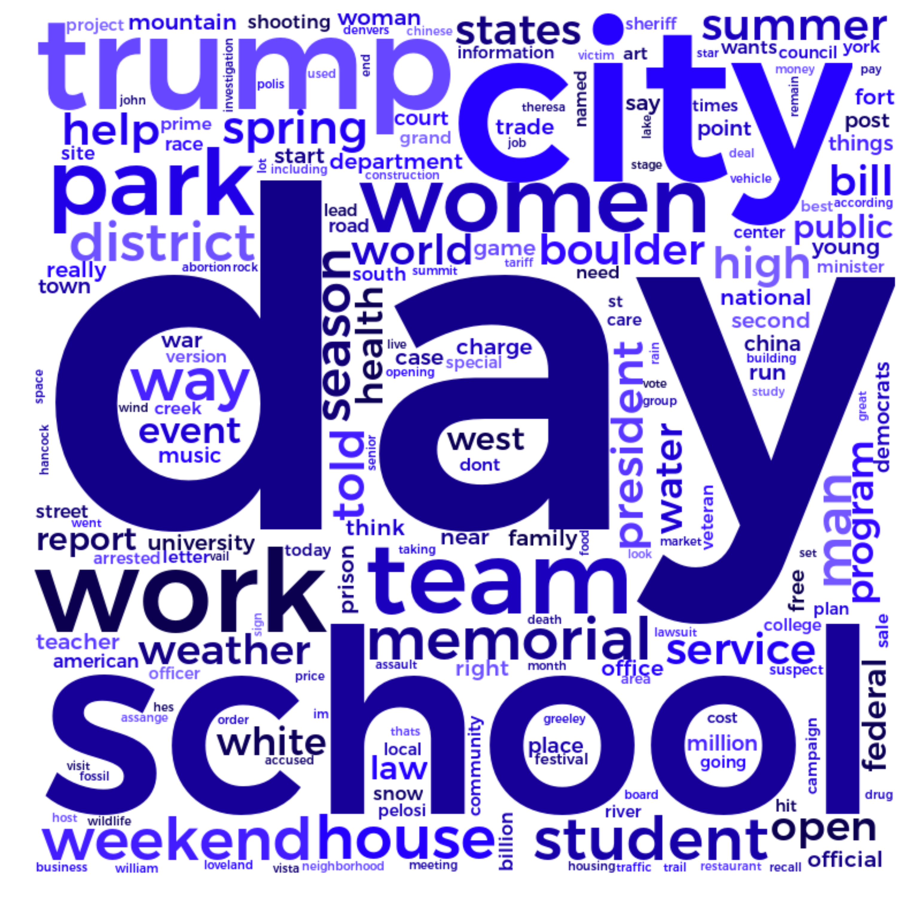
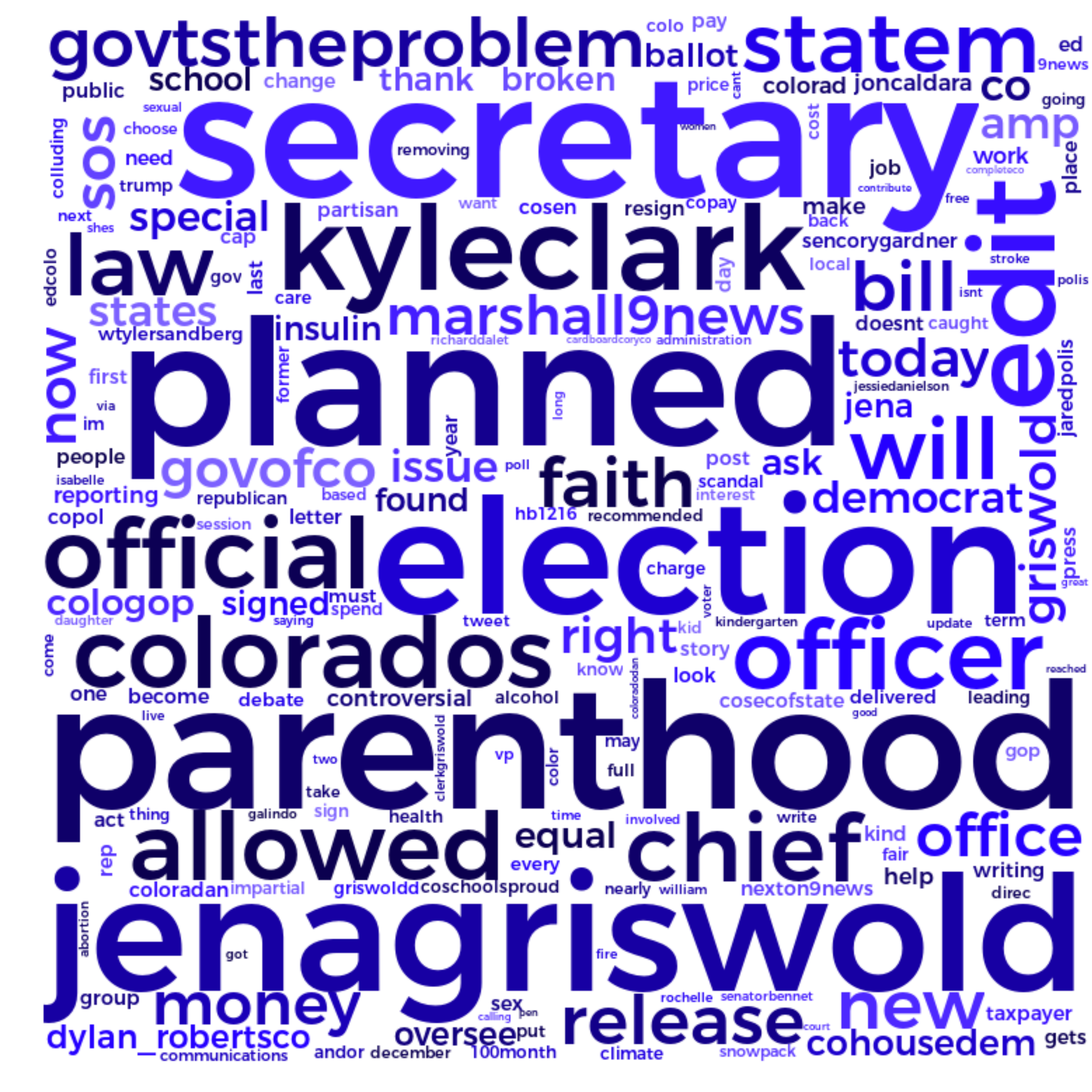
Word clouds are pretty “old-hat” these days. The cloud on the left shows the frequency of specific words throughout yesterday’s press stories. The cloud on the right shows the frequency of specific words throughout yesterday’s tweets in #copolitics.
Word clouds aren’t meant to provide any sort of sophisticated insight. They are simply a convenient way to get an “at-a-glance” look at which topics are getting attention.
Sentiment Analysis
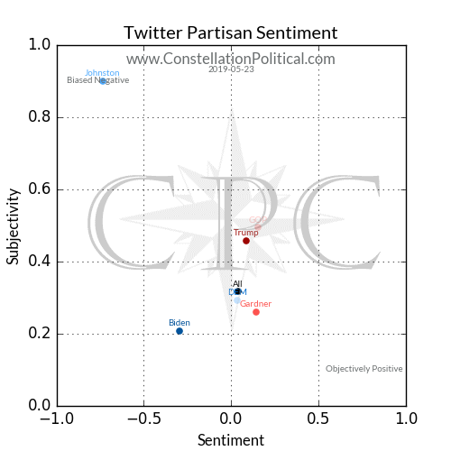
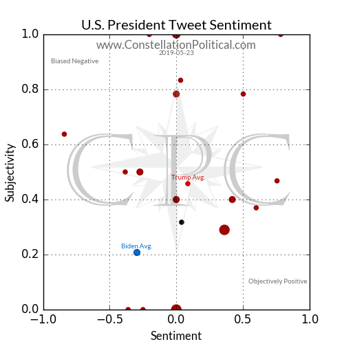
The next row contains aggregate sentiment plots. These graphs show how favorable an entities press coverage and twitter chatter was for the day.
At present we are tracking three levels of media coverage in Colorado. The Presidential race, the Colorado U.S. Senate race, and mentions of the Republican or Democrat parties as a whole.
Sentiment is measured on the x-axis. Lower numbers mean the tone of the text is more negative while positive numbers mean it’s more favorable. Every tweet and article is scored between -1 and +1 on this scale. The dot for each entity being measured appears along the x-axis at the average for that entity.
On the tweet scatter plot averages always fall between -1 and +1. However, on the press scatter plot higher or lower numbers are possible because each entity’s press score is weighted by their number of mentions. This isn’t necessary for tweets because they’re so short. We want to see the red dots further to the right side of the graph and the blue dots further to the left.
The vertical y-axis measures subjectivity. Subjectivity is a measure of how much bias appears in the tone of the tweet or article. A score of 0 means a comment is completely fact based and objective and +1 is wholly biased opinion. As with the sentiment plots the press scatter plot may have figures higher than +1 because of weighting by entity mentions. Unlike sentiment there is no rule as to what level of subjectivity is best.
Each entity’s dot appears at the coordinates for their average sentiment and average subjectivity from that day. There is also an unlabeled black dot that shows the average sentiment and subjectivity for all stories or tweets. This serves as a baseline for comparison, we want Republican organizations to fall to the right of the day’s dot.
Press Performance Time Series

The time series graphs show the raw number of press mentions that each Republican entity received each day compared to their Democrat counterpart. This is shown by the columns and measured on the left-hand axis. As you can see in the above example, President Trump is dominating Joe Biden in press mentions. This is to be expected since Trump is a sitting President and Biden does not even have the Democrat nomination yet.
The lines show the average sentiment of each days press coverage. Just as with the scatter plots, higher positive numbers here mean that entity received better press coverage that day. The sentiment scores are measured on the right-hand axis. Note that in the example above Biden’s sentiment scores are much more volatile than the President’s. This is because he has fewer daily press mentions, thus each one has a bigger impact on his daily average sentiment.
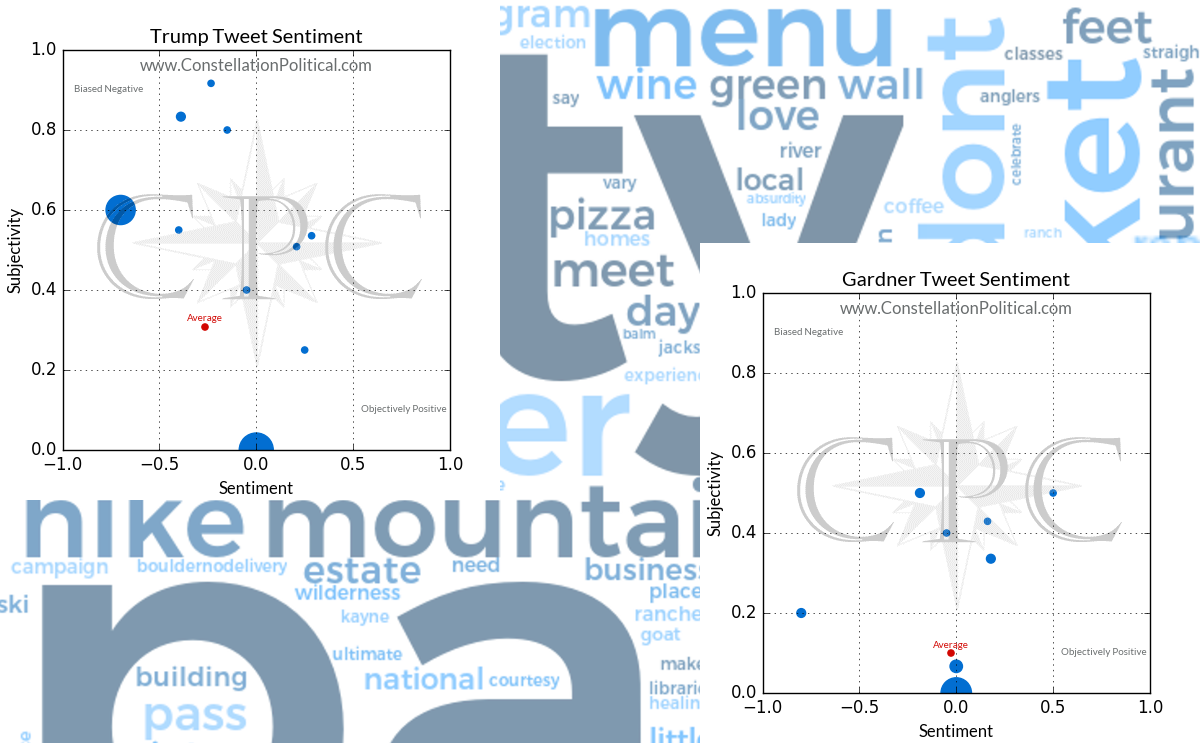
Tweet Scatter Plots
The tweet sentiment scatter plots show the sentiment and subjectivity of each tweet about the Republican entity and its Democrat counterpart from the day prior.
Each dot on the plot is sized according to the number of tweets falling at that point. The more tweets with that particular combination of sentiment and subjectivity, the larger the dot at that point will be. The ‘Average’ dot represents the baseline so use it’s size as a point of comparison.
The ‘Average’ dot for each entity is a marker of where the average of all that entity’s scores for the prior day fell. In the case of the Presidential example above we see the day’s Twitter comments in #copolitics about Trump were more positive and more biased than the average of all tweets. Joe Biden’s tweets were more negative and objective but there were far fewer of them. The single black dot represents the average of all tweets within #copolitics that day for comparison.
Media Outlet Bias
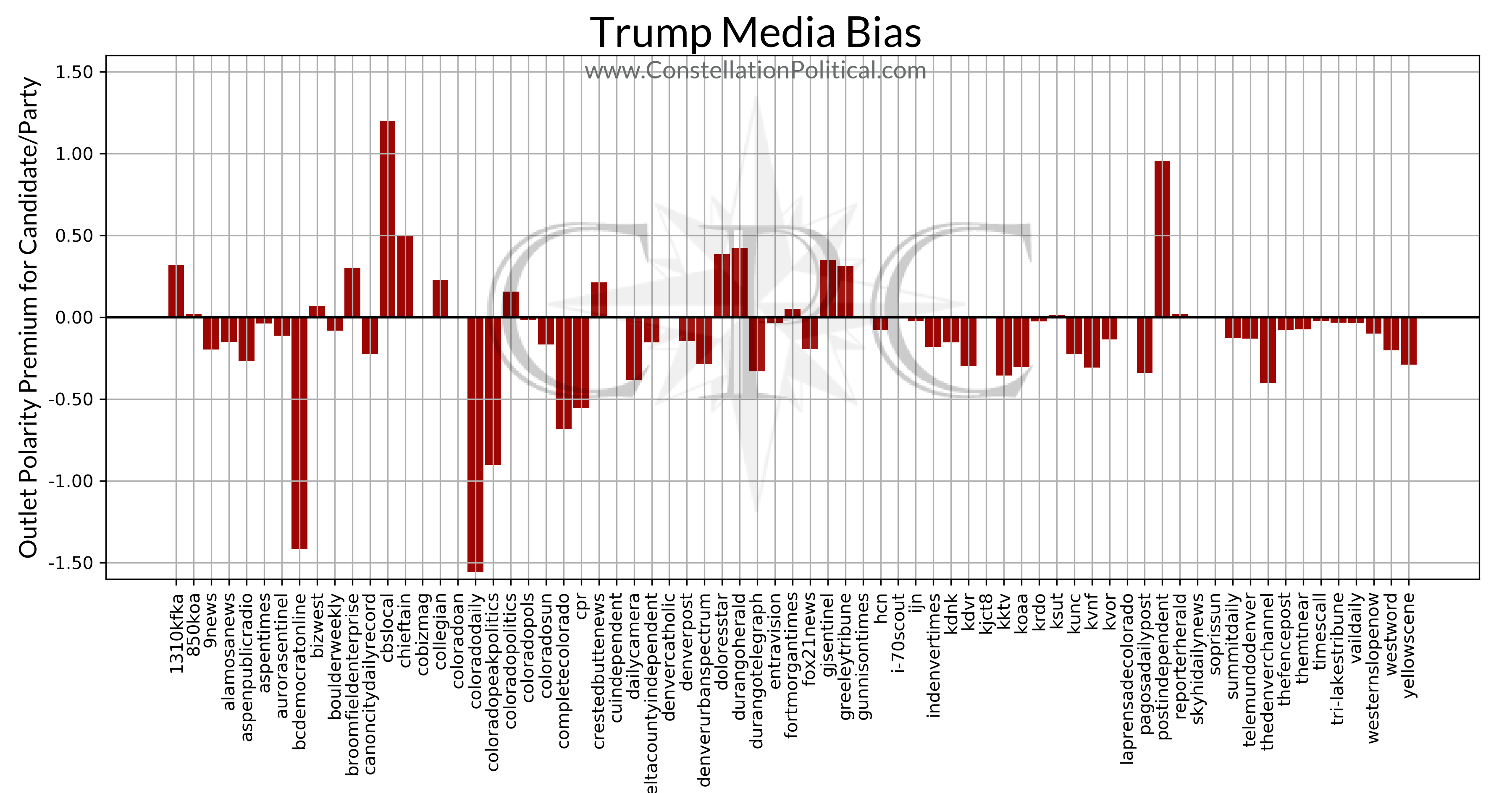
This is the one you have all been waiting for — a quantitative measure of how biased each media outlet is. The graphs in this section are broken out by each entity we are tracking and show every media outlet that has mentioned them in the past three months.
The graphs are generated by scanning all the articles an outlet has produced in the preceding 90 days for mentions of any entity we are tracking. This is done to isolate an outlets political coverage from everything else. Once we have pulled out all of their political stories each one is given a sentiment score using the methods described at the end; higher numbers indicate a story with a more positive tone. We then take the average sentiment of all of that outlet’s political coverage and set that as their baseline.
After an outlet’s sentiment baseline is established it’s articles are broken out according to their subject. This is determined by the number of mentions the article makes of a particular entity. Whichever entity is mentioned the most is taken as the subject of that article. The average sentiment for each entity’s articles is calculated and the outlet’s overall average is subtracted from the entity average. This leaves us with a measure of how bias that outlet is for/against that particular candidate or entity.
Remember, bias is measured against the overall average for that outlet and these results do include opinion pieces like editorials. As such, it’s very possible for a strongly liberal outlet to show a positive bias toward Sen. Gardner in this analysis. If all of their recent coverage has been extremely critical of President Trump that would pull their overall average sentiment lower. If they aren’t quite as critical of Sen. Gardner that would leave them with a positive bias toward Gardner. It isn’t saying that an outlet is a fan of the Senator, just that they don’t hate him as much as they hate everyone else. And if they really do hate everyone else, that’s still a positive bias towards Gardner and thus they would show a positive number for him.
Word Associations
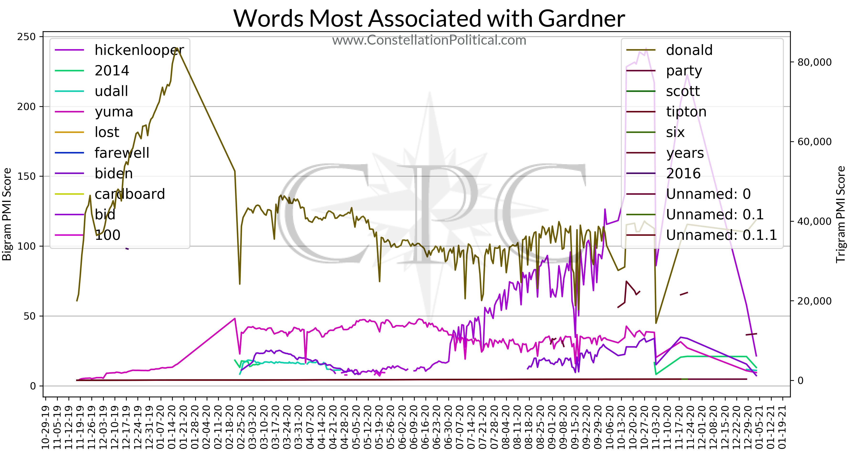
This is probably the most valuable section, especially for political campaigns. This section shows the words with the most powerful associations to each entity. Once again, this is based on all press coverage for the preceding 90 days.
The simplest use of this section is to simply read the legends for the graph to see which words are most strongly associated with each entity. The legends are sorted to show the words with the most powerful associations at the top. The legend on the left shows the most powerful two-word combinations and the legend on the right shows the most powerful three-word combinations. In these instances the first word in each combination is always the candidate/entity name.
The lines on the graph show how powerful the association to each word has been over time. In other words, is the press using that word more or less frequently to describe each entity as time goes on.
Similar to the media bias analysis, these graphs are generated using all press stories from the preceding 90 days that mention any one of the entities we are tracking. In this instance, articles are not categorized by their subject. The analysis for each entity includes every article for all entities.
We scan every article for the entities name and then examine the 20 words around each appearance. The strength of the association is calculated using a pointwise mutual information (PMI) score. This tells us how likely two words are to appear together versus how likely they are to appear on their own. For example the words “Colorado” and “Senator” appear together frequently, however they appear on their own or in other combinations as well so they have a low PMI score. Contrast to the words “Republican” and “candidate” which do appear frequently on their own, but when describing candidates the press almost always mentions their party. As such, “Republican” and “candidate” are more likely to appear together than on their own so they have a high PMI score.
The word association strength is calculated anew each day and the top ten two-word combinations and three-word combinations for that day are then plotted on the graphs back in time to show how the strength of the days associations as evolved.
Press Clips
This section should be pretty self explanatory but a note on how it’s put together.
Once all of the new articles and tweets from the preceding day are downloaded, all of the tweets are analyzed for their most frequently occurring terms. Press stories from outlets that primarily cover politics are analyzed for their most frequently occurring terms as well and these are added to those from the tweet data set.
Once this list of scoring keywords is created we cycle through every news article and score it according to how frequently those keywords appear. Articles are given an additional score boost if they mention one of our target entities.
Once the articles are ranked we pull the ten highest ranked for political news outlets, major media outlets, and local outlets for inclusion in the brief. Note that in many cases small outlets re-post stories from large outlets so there’s occasionally stories from major national outlets within the local news section.
Tweets
This section is also very straightforward. This shows the top ten #copolitics tweets from the preceding day. This is measured by the sum of likes and retweets that each got. The ten tweets with the highest total are included.
But, Ben… uh… what even is sentiment analysis?
That’s a great question and it’s been pointed out that it’s probably one I should have answered from the outset. Let me begin by saying this is an actual science, it isn’t just me saying “that’s good” or “that’s bad.” (Like I have time for that.)
The advent of machine learning gave birth to the ability to teach computers how to recognize the nuances of human speech — written and spoken. Sentiment analysis works by giving the computer a training set of phrases alongside a measure of how positive or negative those phrases are. The computer analyzes groupings of words and teaches itself which combinations of words are associated with negativity versus positivity. Once the computer understands that, we can analyze any phrase by how similar it is to other phrases with known sentiment. Then the computer gives each phrase a score to measure how similar it is to a training phrase of known sentiment.
There are many different types of sentiment analysis but we use Valence Aware Dictionary for sEntiment Reasoning (VADER). This has been shown to be the most effective methodology, especially for analyzing social media like Twitter. As is common practice, the model is trained using reviews — movie reviews, product reviews etc. because these are massive data sets of language that come alongside a quantitative measure of how positive or negative each statement is.