 Turnout & The Trump Effect
Summary
Claim: Trump supporters failed to vote in 2018 because CO Republicans didn’t embrace the President.
Reality: 2018 Republican turnout was higher in precincts that supported Trump in 2016.
Reality: Voters who voted in 2016 but not 2014 and/or 2018 were those that opposed Trump.
The Numbers
In the wake of Republicans’ devastating losses this year, a lot of speculation has gone into whether Colorado Republicans should have been more vocal in supporting President Trump, despite the fact that Trump lost the Colorado caucus, was handily defeated by Clinton in the General, and that polling decisively shows he’s toxic among Unaffiliated voters.
The hypothesis seems to be that not embracing Trump depressed Republican turnout. However, Republican turnout in 2018 was 2.5 points higher than 2014, and 5.7 points higher than 2010. When confronted with this fact, folks pivot to the Unaffiliated voters, and the claim that the Unaffiliated voters who stayed home in 2018 were Trump voters.
As a devout follower of the behavior of Colorado’s Unaffiliated voters, this didn’t make any sense to me. But, I couldn’t say for sure.
So, here is a detailed look at those voters that stayed home in 2018.
You’ll have to bear with me, though, because this one includes even more math than usual.
What follows is a set of simple linear regressions that compare various measures of turnout against the performance of the 2016 Presidential candidates at the precinct level.
For those who need a refresher on scatter plots, linear regression, slope, and goodness of fit, you should skip to the end where I break down one of these graphs in more detail.
The first part of this claim is that Republican turnout was depressed because Republicans were disappointed in the lack of support for Trump from our candidates. To address this claim, I took a look at the change in Republican turnout between 2016 and 2018, and its relationship to the percentage of the vote that Trump received in each precinct.
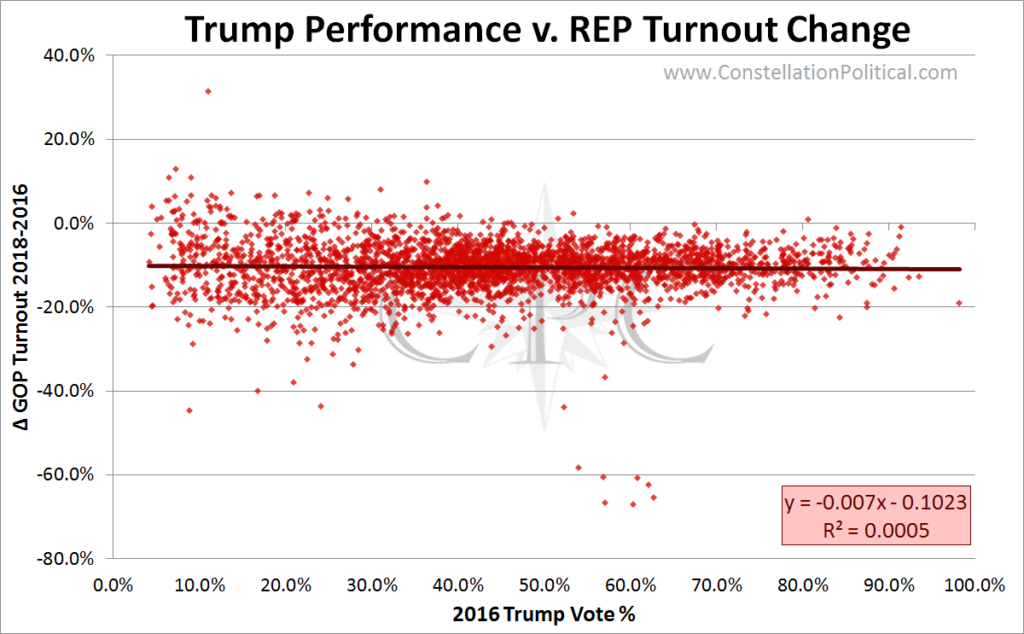
Graph 1 shows that there was no relationship between the drop in Republican turnout between 2016 and 2018 and the percentage of the vote that Trump received.
Turnout declined consistently across the board, hence the flat regression line. And this makes sense because turnout is always higher in Presidential elections. That’s why we don’t typically compare Presidentials to Midterms.
Since there is such a consistent drop in turnout between Presidential and Midterm elections, it could be that the data just isn’t diverse enough to register the Trump effect. So I took a look at the 2018 turnout compared to the percentage of the vote Trump received.
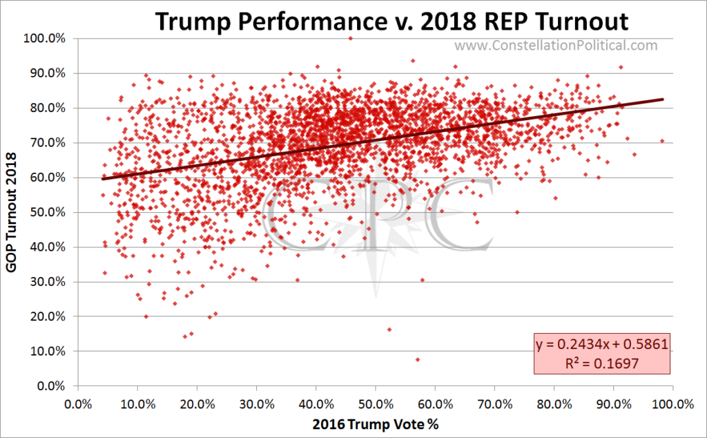
The correlation shown in Graph 2 is still weak but it’s much stronger than the correlation in Graph 1. This shows exactly what you’d expect — the greater Republican turnout in a precinct, the better Trump performed there. Republicans who like Trump turned out at higher rates. So, not very interesting.
But this is…
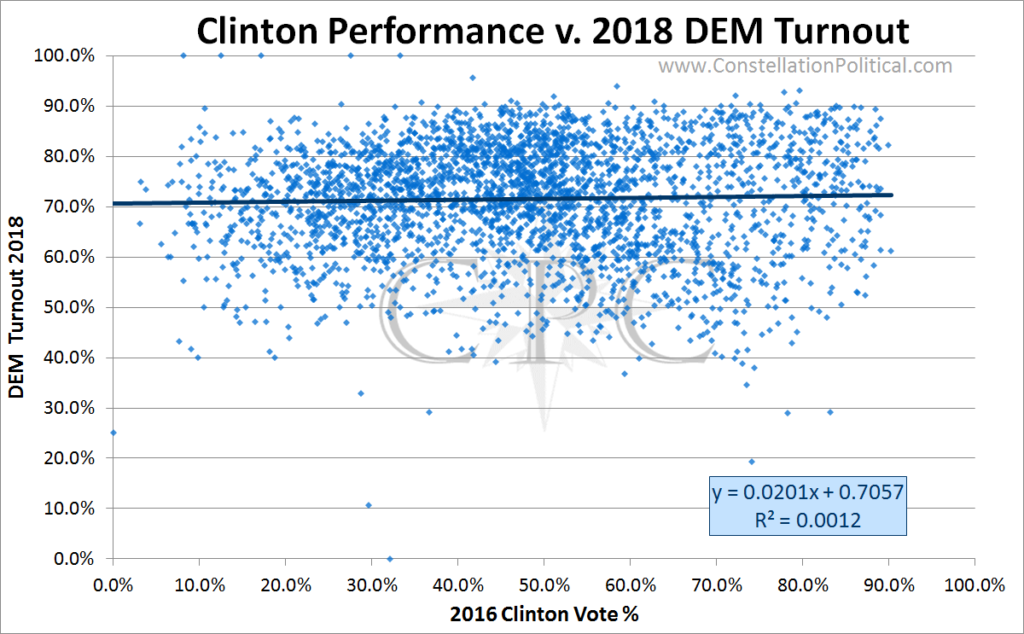
Graph 3 shows the relationship between Democrat turnout in 2018 and the percentage of the vote that Clinton received in 2016. There appears to be no correlation between Clinton’s performance and Democrat turnout…
Between Graphs 1 & 2, it’s clear that Trump Republicans didn’t stay home in 2018. But what if that group is just getting drowned out by traditional Republicans? What about Trump supporters across all parties?
To account for this let’s look at folks who voted in 2016 but didn’t vote in 2014. One could make an argument that this group of people includes those who were uniquely motivated to turnout in 2016 because of their support for Trump.
…or not.
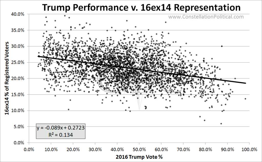
Graph 4 shows the percentage of the vote that Trump received in 2016 versus the percentage of a precinct that voted in 2016, but not 2014. The correlation is weak, but the more new voters a precinct had in 2016 the worse Trump fared. That means folks weren’t turning out to vote for Trump, but rather to vote against him.
Odds are this group who only turned out in 2016 were exactly who you’d expect; your typical voter who skips Midterms but shows up for Presidential elections — that is to say Unaffiliated, young, and all around disengaged. This group is much more likely to vote Democrat regardless of the Democrat.
Let’s go one step further and look at folks who voted in 2016, but didn’t vote in either 2014 or 2018. Maybe that is the true group of Trump supporters.
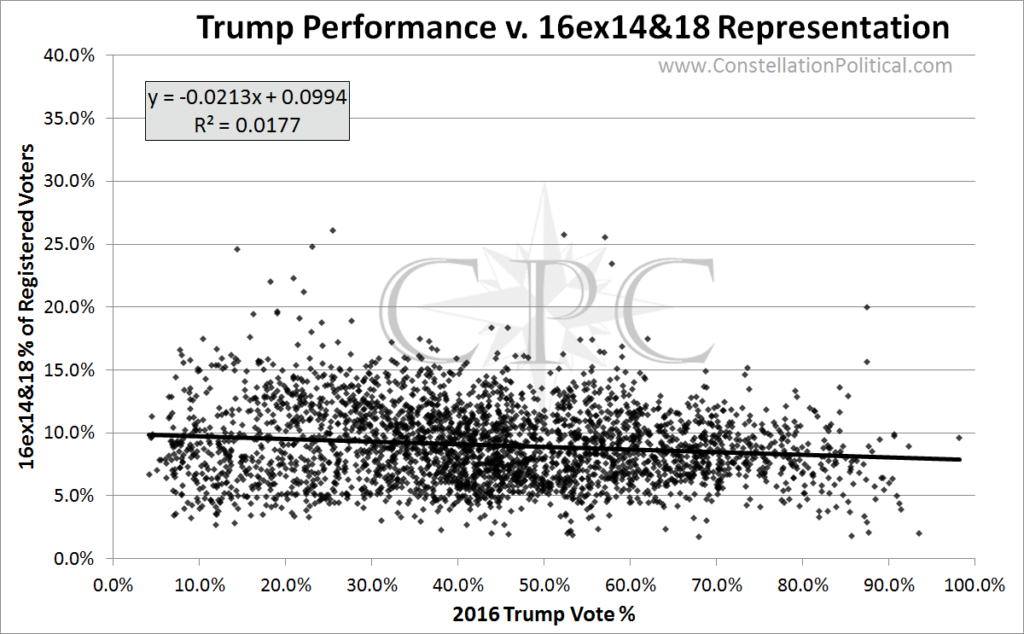
Nope. Graph 5 is similar to Graph 4. It shows the percentage of the vote that Trump received versus the percentage of a precinct that voted in 2016, but neither 2014 or 2018. The correlation is basically non-existent but it is slightly negative, meaning, folks who voted in only 2016 voted against Trump.
Let’s also consider the size of this group. Folks who voted in 2016 but didn’t vote in 2014 breaks down like so:
REP: 220,817
DEM: 294,312
UAF: 401,833
OTH: 23,027
Folks who voted in 2016, but didn’t vote in 2014 or in 2018 breaks down like so:
REP: 92,449
DEM: 99,397
UAF: 165,122
OTH: 10,623
If every Republican who voted in 2016 but not 2014 turned out in 2018, and voted for Walker Stapleton he still would have lost by 175,638.
Clearly Republicans had bigger problems than a few disaffected party members staying home.
How to read these graphs
If it’s been a while since your high school stats class, here is a quick refresher on simple scatter plots and linear regression. We’ll use the easy graph below as a reference.
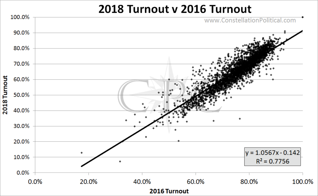
Graph 6 shows the relationship between a precinct’s turnout in 2016 and 2018.
The horizontal (x) axis shows the percentage of voters in that precinct that cast a ballot in 2016. The vertical (y) axis shows the percentage of voters that cast a ballot in 2018.
Each dot on this graph represents one Colorado precinct.
The black line that slopes upward is a regression line. The computer draws this line by figuring out how to draw a strait line that minimizes the distance between the line itself and each one of dots.
In the bottom right box there are two pieces of information: the equation of the regression line and the correlation or “goodness of fit” of that line.
The equation for this regression line is y=1.0567x – 0.142
The way to read this equation is that for every 1 point increase in 2016 turnout there is a 1.0567 point increase in 2018 turnout.
The R2 value shows the strength of the correlation between the regression line and the actual data. An R2 of 0 means that there is no linear correlation at all between the two sets of data. An R2 of 1 means that there is a perfect correlation between the two sets of data. For a correlation to be meaningful the R2 number should be above 0.80.
As such, most of the electoral regressions in this analysis cannot be said to be truly meaningful. But they can provide insight about whether the relationship between our data sets is positive or negative. And that is what we are really interested in.