 CPR attempts election analysis. …it goes poorly.
Recently, I pointed out a small error in a story that Colorado Public Radio had run about Sen. Priola’s 2020 race for Senate District 25. At the beginning of the story, Bente Birkeland wrote “…and with his district shifting increasing blue…” I pointed out that the opposite was actually true — SD-25 has grown steadily more Republican under the current legislative map. In their defense, Megan Verlee, also of CPR, took me through their reasoning. I’m quite grateful she did as it was very enlightening. In the course of her explanation, she made many common errors in political analysis such as:
Including no data about SD-25, the district in question (most shocking)
Using levels to analyze a series with an underlying trend (most dangerous)
Cherry-picking data to support a pre-set hypothesis (most deceptive)
Conflating candidate performance and district composition (most nuanced)
Failing to account for differences in district geography (most difficult)
Ignoring Occam’s Razor (fastest)
With so many errors in one place, I thought this a good opportunity to explain each in detail. This way members of Colorado’s political press corps can avoid repeating these mistakes and readers can avoid falling for them.
My Complaint
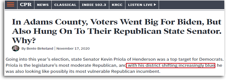
Let’s start with a little background. Here is the story I’m referring to and the claim that caught my attention.
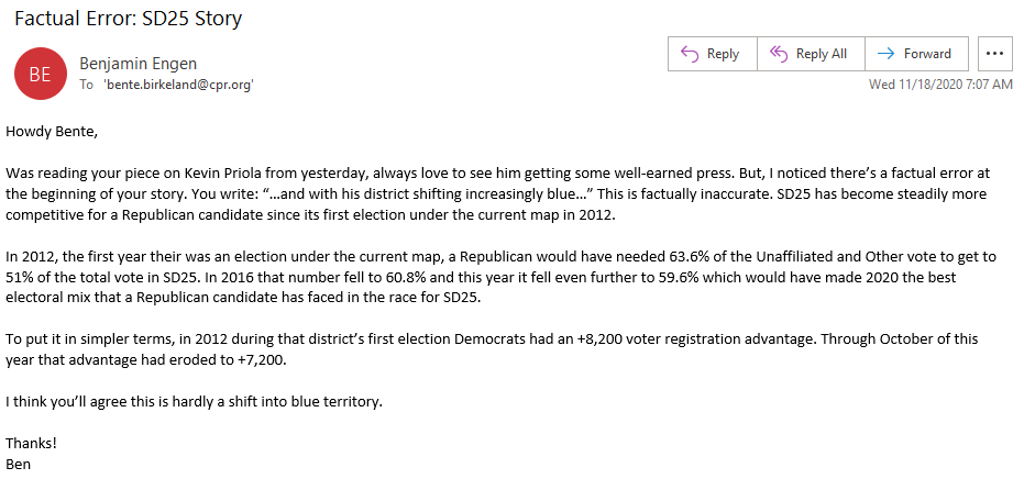
My initial email explaining the issue:
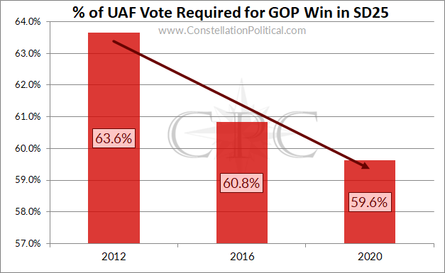
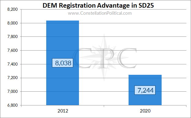
Here are two graphs that illustrate my points, although I didn’t include them in my initial- email.
And Megan Verlee’s explanation of their methods:
Now, let’s dig into their analysis.
Not Using Data From SD-25
This shouldn’t require much explanation. But, when analyzing a political district it’s best to use data from that district. CPR opens their explanation by dismissing data on the makeup of the district in question, contending that this is less relevant than election results from completely different districts that partially overlap SD-25.
I’m not even sure how to refute this assertion except to say that when studying a thing, the preferred method is to study the thing itself. CPR’s approach is akin to asserting that the best way to go about discovering life on the Moon is by studying its nearest neighbor — Earth.
Analysis Using Levels, Not Rates
This is a point that I’m constantly having to make and re-make to political journalists. I’m sure to them it seems trifling, but the media’s (and I do mean this broadly, our CO reporters are generally a cut-above) sloppiness about this point is now directly contributing to the spread of conspiracy theories about the 2020 Presidential race being rigged.
The confusion between rates and levels in time series analysis is quite common in political reporting. If you aren’t familiar with the terminology, this is the difference between saying:
“…a Republican won HD-30 by just over 100 votes in 2014…”
LEVEL
and saying
“…a Republican won HD-30 by 0.6 percentage points in 2014…”
RATE
Both are technically true but when making comparisons across time, only the latter is right.
Look at the damage sloppy reporting around this issue has done just in the past two weeks:
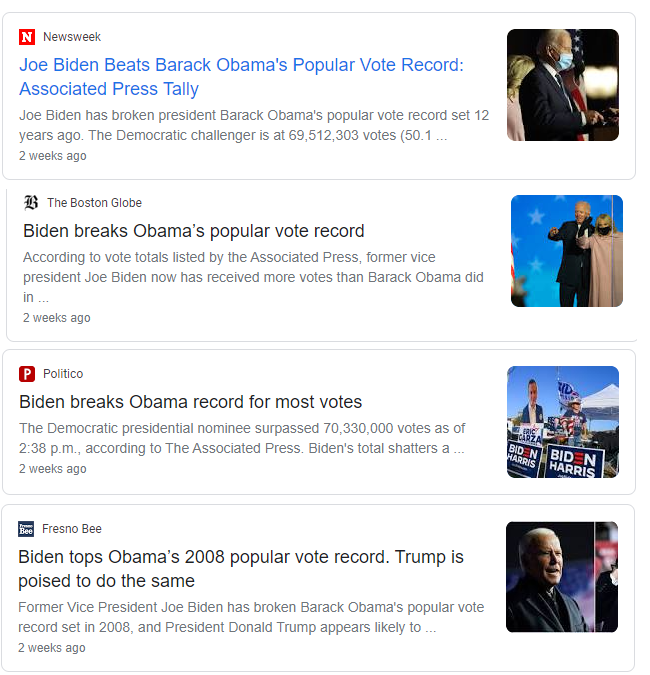
I’m sure everyone has seen the headlines in Image 2 by now. Joe Biden set the record for the most raw votes ever received by a Presidential candidate. Joe Biden received even more votes than the wildly popular President Obama. “Biden is better than Obama!?” Let’s take a jaunt over to Facebook and see what kind of reaction that news garnered from the black-helicopter set.

The claim that Joe Biden was more popular at the polls than Barack Obama was met with utter disbelief by most. For the conspiracy theorizers of the world, these headlines were tallied as further evidence that the 2020 Presidential election was a fraud.
Of course, if Facebook had been holding up their end of the bargain they would have slapped one of those “Lacks Context” warnings on all the stories about Biden setting the popular vote record.
Is it really possible that Joe Biden is more popular than Barack Obama? No, no it is not.
So, what are all these people overlooking? The same thing that every politico and journalist who references vote totals and not percentages is — that the population is growing!
Of course, Joe Biden got more votes than Barack Obama. There are more voters now than there were then — it’s as simple as that. A more accurate comparison would be to look at the percentage of the vote that the two candidates got.
Here’s a fun comparison:
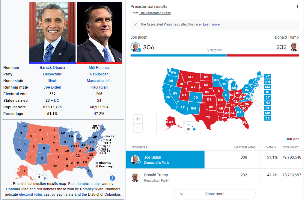
Image 4
Using the proper, percentage of vote, comparison the national outcome of the Trump-Biden contest is identical to the outcome of Obama-Romney. In both cases, the Democrat received 51.1% of the vote vs. 47.2% of the vote for the Republican. Now that sounds more believable doesn’t it?
Unfortunately, that headline just isn’t as “grabby.” And this is exactly how this skewed analysis gets injected into our media coverage. Political operatives rely on raw vote margins to present a favorable case for their chosen narrative when the more accurate election outcomes don’t. In the case of the 2020 Presidential, a Biden staffer likely noticed this record and gave it to a reporter who either didn’t understand the math or was also committed to furthering this narrative. And, because it’s a catchy headline, the story took off despite the fact that it really wasn’t all that interesting. In providing no context for the Biden record, the press inadvertently fueled a conspiracy theory they claim to condemn.
Returning to the subject at hand, the above is the exact same error that CPR made in their analysis.
Let’s apply the above to the defense that CPR offered for their analysis of SD-25.
In HD-56. they note:
In HD-56, the Republican margin was around 10k votes in 2014 and 2016…
In 2014, the Republican in HD-56 won by 30.6 points with a margin of 9,998 votes. In 2016, the Republican won by a greater vote margin at 10,630 but by a smaller point margin at only 23.2 points. How is this possible? Because 13,000 more people voted in the 2016 Presidential, of course! By CPR’s reasoning, 2016 was a better year for HD-56 when, in fact, it was worse by a factor of almost a-third. Funny enough, doing this analysis correctly would have made CPR’s case stronger.
Cherry-Picking Data
CPR also omits from their analysis any years that don’t conform to their pre-determined narrative. Many primers on data-literacy showcase this behavior as the most egregious and easiest-to-spot sign of an attempt at outright deception.
All of CPR’s performance references are to outcomes 2014-2018. Coincidentally these years represent the high and low for Republican performance under the current legislative map. Look at how CPR’s example districts (which oddly omit SD-25, the district in question) performed during ’14-’18 using the proper, rate, comparison:
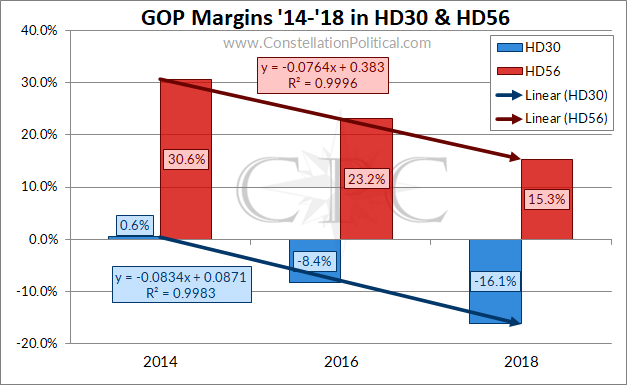
It does, indeed, appear that both of the State House districts CPR references are “shifting increasingly blue.” In fact, those districts show an almost perfect linear trend in “shifting increasingly blue” as indicated by the R2 of 0.99. However, these districts existed in their current configuration in 2012 as well. And yet, CPR oddly leaves those results out of their analysis. Let’s see what happens when we factor in 2012:
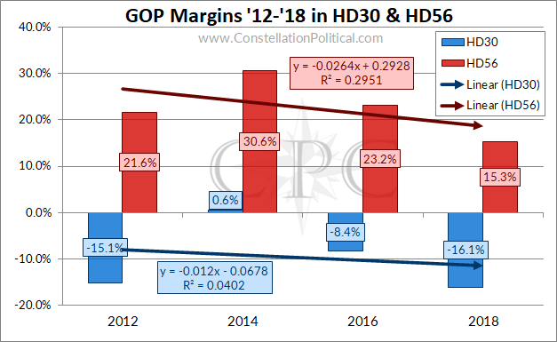
Those trend lines are certainly flatter now. In fact, they don’t even rise to the standard of showing a trend. Typically one would look for an R2 above 0.80 to say that a straight line adequately describes the accompanying data. As you can see in Graph 4, both trendlines are well below that.
Most damning of all, though, is that CPR omits the 2020 election results from their analysis. An interesting choice considering the article in question was about Sen. Priola’s race in 2020. Of course, I can see why they chose to do that…
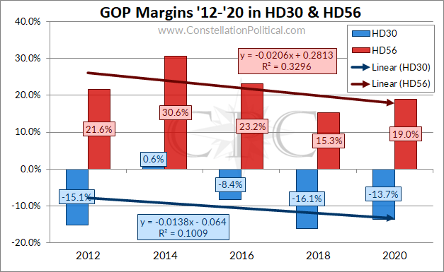
Both of CPR’s comparison districts performed better for Republicans in 2020. If I were to play their game of only choosing data that fits my narrative, I could now claim that these two house districts have been “shifting increasingly red.” Voila!
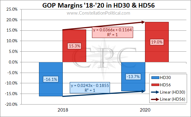
Indeed, the trend in my Graph 6 example is the best fit of any of them. Of course, I wouldn’t cherry-pick data this way because when making declarative, math-based, statements we have to include all the data.
If we wanted to do something truly novel we could examine the trend in the results from SD-25, the district actually in question:
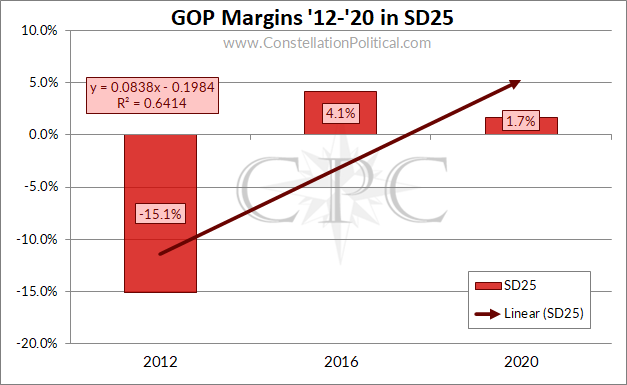
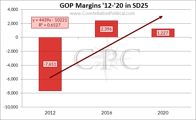
There is a clear upward trend in the Republican margin of performance in SD-25 over the course of its existence. This Republican trend is even evident if we use the improper approach favored by CPR of using vote margins instead of percentage margins. In both cases, the upward trendline showing SD-25 growing increasingly Republican has a better correlation to the data, a higher R2, than the trendlines in CPR’s comparison districts of HD-30 and HD-56.
Conflating Candidate Performance and District Composition
Graph 7 is a nice illustration of another error in the CPR analysis — confusing candidate performance for district composition. The main driver of the upward trend in Republican performance in SD-25 is the abysmal margin in 2012.
Using CPR’s logic, the 19.2 point improvement in Republican performance between 2012 and 2016 proves the district became 19.2 points more Republican. Of course, there’s a simpler explanation as well — that Kevin Priola was a much stronger candidate who ran a much stronger campaign in 2016 than John Sampson did in 2012.
This is the most subtle mistake that the CPR analysis makes. It likely wouldn’t be obvious to anyone who hasn’t actually gone through the exercise of weighing a candidate’s prospects for success. If Sen. Priola had examined only the past performance of the district before committing to run for State Senate in 2016, it would have appeared solidly blue. But, looking at the actual composition of the district as in Graph 1 shows a more accurate picture — a district drifting Republican where success required a decisive, but attainable, victory among Unaffiliated voters.
Using candidate performance as a proxy for district makeup also fails to account for one of the most important elements in politics — money.
In 2012 there was little-to-no outside spending in the SD-25 race. This is in contrast to both 2016 and 2020 when Republicans and Democrats alike spent heavily on the race. In 2020, SD-25 was virtually the sole target of outside spending by groups on both sides of the aisle. The astronomical sums spent on elections mean candidate results are often more a reflection of spending than of district composition.
Down-ticket races are also heavily influenced by the national and statewide environments and the top of the ticket. In fact, this pattern shows up nicely in Graph 5:
Different types of elections are intrinsically different because they have different turnout dynamics. At the highest level, this should be obvious — more people turn out in presidentials than midterms than off-year elections. There is also an oft-cited pattern wherein the president’s party suffers in the subsequent midterm after their election.
In Graph 5 we see the high-water mark for Republican performance was in 2014, after President Obama had been re-elected in 2012. The low point for Republican performance was in 2018, after President Trump was elected. The national climate skewed the down-ballot results in a way that allowed CPR to create a “district shifting increasingly blue” by cherry-picking the 2014-2018 timeframe for their analysis.
The reality is, the further down the ballot you move, the more candidate performance becomes a reflection of the national environment and less the district or candidate themselves. I’ve touched on this before in addressing the weakness of comparing down-ticket races to up-ticket races.
Failing to Account for Differences in District Geography
Unless two political districts share identical boundaries, any analysis performed using comparison is going to be off. This is yet another advantage to using data from the actual district in question rather than trying to draw conclusions from districts with partial overlap.
The worst case of this is CPR’s attempt to use Adams County as a proxy for the makeup of SD-25:
“First, after 2014, Republicans held several county offices. As of 2020, Sen. Priola and Rep. Bockenfield (sic) are the only Republicans representing the county above the municipal level.”
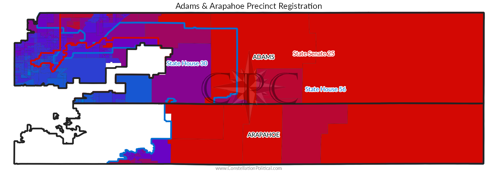
Map 1 makes obvious why Adams County is such a poor comparison to SD-25. SD-25 doesn’t include any of the “bluest” portions of Adams County. The inverse is true in trying to make a comparison between HD-30 and SD-25. HD-30 doesn’t include the most Republican portions of Adams County that make SD-25 more competitive for Republican candidates.
If you absolutely must use results from one district to draw conclusions about another it’s best to only include those precincts that are actually contained within both districts.
Occam’s Razor
For the casual reader, all of that B.S. up above is way too in the weeds. But there is a simpler approach, and it’s the approach I first used when reading the original CPR article.
Ask yourself: “What is more likely?” Is it more likely that Sen. Priola won a Democrat district, that’s trending even more Democrat, in a wave year for Colorado Democrats? Or is it more likely that SD-25 is “shifting increasingly red” and isn’t as Democrat as people think?
This is where the CPR analysis really falls apart. CPR explains that their sources:
…assessments go beyond raw voter registration numbers to track voter sentiment and behavior in the district and factored into our assessment as well.
CPR gives more weight to baseless “assessments” of voter sentiment and behavior than they do to the behavior of the voters themselves. The voters are shifting their registration away from Democrats (Graph 1) and they’re increasingly choosing a Republican candidate for State Senate (Graph 7). By CPR’s logic, it is the registration and election results that are wrong, not the “assessment” given to them by “people.”
Imagine someone claiming that the error in the 2020 Presidential predictions was with the election results themselves and not the polls.
Oh… well actually I guess someone is claiming that.
You just now figured out Colorado Public Radio is a waste of resources owing to bias and incompetence?
Better late than never.