 Slippery Stats
We all know that data is very en vogue these days, and not just in political circles. Everyone wants to be a, or better yet the, data guy. Predictably, this has led to a proliferation of squishy math, soft stats, and outright errors. While I love quick approximations, pretty graphs, and smart-sounding quips as much as the next guy there is an obvious danger to relying on bad numbers.
So let’s go through some of the most common political math fallacies so that you too can ridicule others for making these mistakes. Because we all know public ridicule is the most effective form of instruction.
Active Voters
Split-ticket
Perfect Voter Scores (PV, PVG, PVP)
Undervote
Active Voters
Let’s cut to the chase on this one. If you’re using “Active Voters” or “Active Registration” for any sort of calculation, observation or comparison you’re doing it wrong.
As with most things, I learned this lesson this hard way. Some 15 years ago during my first campaign as a paid staffer, I was having a discussion about turnout with my more experienced peers. In the course of bragging about turnout in my home county of Jefferson I remarked that we’d had 98% turnout in the prior election. I was immediately and soundly bombarded with ridicule. “What!? Of Active voters? Hell! I bet it’s even higher if you only consider people who vote in every election!”
They were right of course, and I’ve made sure to pay-forward this ridicule ever since.
You can’t just pick whatever favorable group of voters you want to calculate turnout. Using “Active Registration” in your turnout calculations is no different than calculating turnout using only voters who have voted in every election for the past 10 years. Your calculation may be technically true but it doesn’t carry the weight of insight and can be dangerously misleading.
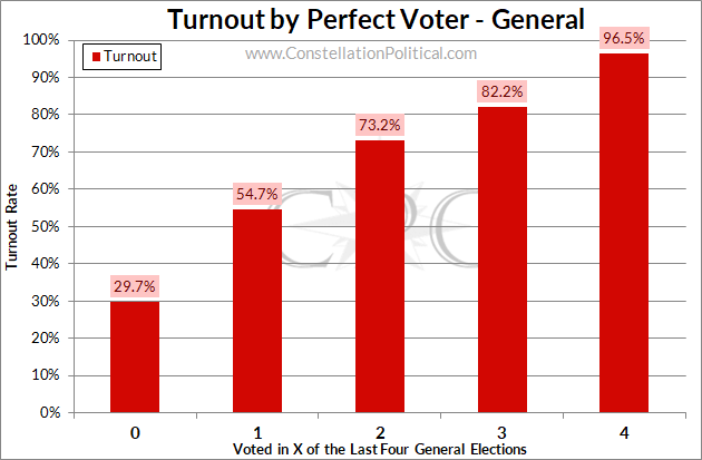
Graph 1 shows 2016 turnout based on how many General Elections out of the past four a voter cast a ballot in. Believe it or not, voters who vote consistently turn out at higher rates. Shocking! If we really want to make things look good we may as well bag “Active Voters” and just count people in the right-most column.
And if you’re thinking of jumping on me for using a metric, PVG, that I also said was bad in the intro… did you read the part where I said I like quick approximations?
The real problem with using “Active Voters” is on the left-hand side of Graph 1. In 2016 turnout among voters who had never cast a ballot before was 30%. This isn’t newly registered voters, this is voters who had an opportunity to participate but never did. In 2016, 5% of all ballots cast in the election came from voters who had never cast a ballot.
If you’re tempted to write-off 5% as an inconsequential contribution, consider this — the average absolute margin in our competitive State Senate races that year was only three points.
You don’t use “Active Voters” because you’re cutting out voters who could ultimately swing an election.
…it also makes state-to-state comparisons difficult but that’s a no brainer.
Split-ticket
Split-ticket and undervote aren’t bad stats in and of themselves. The problem is that they’re way more complicated than most people realize. This leads to a lot of abuse. The interaction between the undervote and split-ticket calculations is a classic example of why I’m always railing against using levels. Because one impacts the other, you need to be using rates, not levels in these calculations.
You want to avoid statements like this:
“As for split-ticket voting in 2018? In House District 37, Democratic candidate Sullivan won by over 3,000 votes and Democratic Gubernatorial candidate Jared Polis won by 4,000. That indicates a little bit of ticket-splitting in Cole Wist’s favor, but not nearly enough to hold onto the seat.”
It is accurate that Cole Wist’s margin was 1,000 votes better than Walker Stapleton’s. But is that because of ticket-splitting? There’s no way tell if that’s the case from that statement.
Consider this additional fact: 1,000 fewer ballots were cast in Cole Wist’s race than in the Gubernatorial contest in HD37. The difference in margins and the undervote are suspiciously similar. Which seems more likely? That the difference in margins between the Gubernatorial and State House was the result of ticket-splitting or the result of Democrats who voted for Polis simply not casting ballots in the State House race.
The correct answer, by the way, is “Beats the hell out of me.” (Ok, yes, yes there is a way to figure that out. If someone wants to post the answer in the comments they’ll get some well-deserved kudos.)
Using the percentage margin in these races makes the split-ticket calculation easier and more relevant because you know you’ll total to 100%
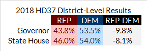
Table 1 shows that in the Governor’s race Stapleton lost by 9.8 percentage points. This compares to Wist, who lost by 8.1 pp. The margin in the State House race was 1.7 pp better for Republicans so ticket-splitting must have accounted for 1.7 pp of the result. Unless, of course, we’re missing something else…
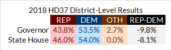
Table 2 shows what the results in these two races actually looked like. The Gubernatorial race had third-party candidates whereas the State House race did not. We aren’t even comparing apples-to-apples with these two races.
Without the option of a third-party in the State House race, we now have 2.7 percentage points to account for. The Republican percentage in the House race improved by 2.2 points relative to the Gubernatorial and the Democrat percentage by 0.5 points. So it would seem that the absence of a third-party benefited Cole Wist in his race, or rather, the presence of third-parties hurt Walker Stapleton in his Governors race.
Unfortunately, this is really just telling us about the impact of third-parties and not much about the crossover between Republican and Democrat choices by race. As I’ve previously noted, this kind of analysis also tells you more about what’s happening at the top of the ticket than it does about the down-ticket races as well.
So we still don’t know much about what’s happening with the ticket-splitters, now what?
And in that question lies my whole point. People who try to calculate ticket-splitting this way are over complicating things only to produce flawed results. This is no different than the problems I addressed so extensively in The SD20 Fallacy. There is a much easier, and more accurate way to calculate the propensity for voters to split tickets – Partisan Intensity Regression.
But that’s a subject for another post, the subject here is not to calculate your split-ticket performance using levels or simple addition and subtraction and to be wary of those who do.
Perfect Voter Score
“Perfect voter scores” and their counterpart “propensity” have been staples of political analysis for longer than I’ve been around. I even use them, as you saw above. Perfect voter scores are fine for estimation but you don’t want to rely on them for anything critical, like setting your contact universe.
Perfect voter scores take a couple of forms — Overall, General, and Primary. You may see these abbreviated PV, PVG, and PVP. Each one is the number of referenced elections out of the last four that a voter has cast a ballot in. For example, if you have a voter who only voted in Presidential elections, their PVG right now would be 2, because they would have voted in ’16 and ’12 but not ’18 or ’14.
These numbers are often used as a proxy for a voter’s likelihood to vote in an upcoming election. Hopefully, you’re starting to see the problem now…
Perfect voter scores always consider the last four elections. And that’s fine, you want consistency in your calculations. But what about the voter who registered in October 2018 and voted for the first time in that General Election? This voter would have a PVG of 1 and would be treated as unlikely to vote in the future. But in reality, this voter has cast a ballot in 100% of the elections that they’ve been eligible for. That sounds like someone who is likely to vote to me.
This is why you want to calculate actual turnout probabilities when it comes time to set your contact universe rather than relying on “perfect voter scores” or historic results.
Undervote
Undervote isn’t so much a flawed metric as it is overused, misused, and all-around meaningless. Indeed undervote is inextricably linked with legislative aides in my mind because they seem to be the only ones who use it, and then it’s as a catchall for everything.
For example:
“We can’t win that seat, we don’t even have a Republican candidate.”
“Nah, brah, you gotta look at the undervote.”
Facepalm.
When applied, the wisdom is that the greater the undervote, the better the Republican candidate fares in that race. The logic here being the same as for turnout — more engaged voters tend to favor Republicans. If you either aren’t bothering to vote at all or are skipping lines on the ballot, you probably aren’t a very engaged voter.
The data demonstrates this effect as well.
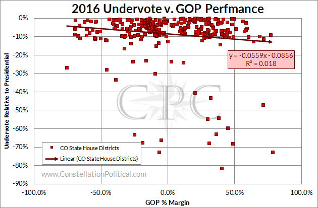
However, as you can see in Graph 2 the effect is so minimal it may as well be non-existent. Whether it’s through empirical realization or not, seasoned campaigners seem to understand this and leave undervote discussions where they belong — with leg aides.